Marketing Audit Checklist:
How to Spot What’s Working
and What to Fix
Yes! A marketing audit checklist you can actually use with practical steps and tips for reviewing performance, finding gaps, and…
Read More
Did you know that around 97% of users check out a company’s website before doing business? Without a doubt, your website is often where first impressions are formed and decisions are made. Just like in a brick-and-mortar store, your web design strategy (i.e., the layout, aesthetics, and usability of your space) can greatly influence whether visitors feel welcome and engaged or overwhelmed and disinterested.
At Ironistic, we’ve seen our fair share of websites that scream for a makeover — not because we’re judgmental, but because we know the potential they have to be so much more.
Let’s dive into the common website design mistakes and how you can fix them. Plus, we’ll guide you on recognizing when it’s time for a redesign. And yes, we’ll sprinkle in some shining examples of transformations we’ve proudly performed.
Creating a compelling online presence goes beyond slapping together a few pages and calling it a day. It’s about crafting an experience, telling a story, and guiding your visitors toward a goal. However, even the best intentions can go awry without the right strategy. Below, we outline some of the most prevalent pitfalls encountered in website design and, more importantly, how you can navigate your way out of them.
Ironically, the first mistake many businesses make is not having a clear web design strategy. A website without direction is like a ship without a compass; it might look impressive, but it’s not going anywhere significant.

Before diving into design elements, define your objectives. Are you looking to increase sales, boost engagement, or establish authority in your niche? Every design decision should align with these goals.
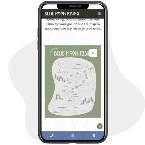
A great example of this is the site, Blue Moon Rising. We created an interactive cabin map in the sentence for a better user experience to define the goal of finding your perfect cabin and booking.
In today’s world, if your website isn’t friendly to the smartphone-wielding masses, you’re essentially telling a huge chunk of your audience, “Sorry, we’re closed.” A non-responsive design that looks like a jigsaw puzzle on small screens is a major faux pas.
 Embrace responsive design. This ensures that your site looks fabulous and functions flawlessly across all devices. It’s like having a magic wand that adjusts your website to fit perfectly on any screen, anywhere, anytime.
We live in a world where patience is as thin as the latest smartphone model. A slow-loading website is akin to being stuck behind a tractor on a single-lane road when you’re already late. Frustration mounts, and before you know it, your visitor has U-turned to a competitor’s faster-loading site.
Optimize everything — images, videos, scripts. Consider a better hosting solution if necessary. This is not just about making your visitors happy; search engines love speed too. It’s a win-win.
Ever been lost in a maze? That’s how users feel when they can’t find what they’re looking for on your website. A complicated or unintuitive navigation menu is like giving your visitors a puzzle instead of a map.

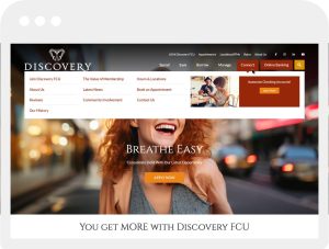
Simplify. Ensure your navigation menu is easy to find and understand. Use clear, descriptive labels. Think of your website’s navigation as your home’s hallway — clear, well-lit, with doors marked plainly so guests know exactly where they’re going. A great example of this is the Discovery FCU website.
Content is king, but cluttered, outdated, or irrelevant content is more like the court jester. Overwhelming your audience with walls of text, ignoring content hierarchy, and not updating your info can turn your site into a digital ghost town.
Refresh and declutter. Break text into digestible chunks. Use headings, bullet points, and images. Update regularly to keep things fresh and relevant. Remember, your content is a conversation with your audience. Keep it engaging.
A picture is worth a thousand words, but the wrong picture can send your visitors running for the hills. Poor quality images, inconsistent branding, and a color scheme that looks like a toddler’s art project gone rogue can severely impact your site’s professionalism and appeal.
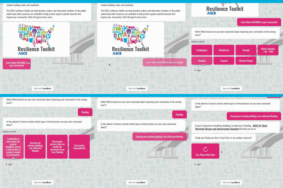
 Invest in high-quality imagery and maintain a consistent brand voice and visual style. Choose a color palette that reflects your brand and is easy on the eyes. Your website should wear your brand like a tailored suit — perfectly fitted and impressively sharp. The visuals we did for ASCE is a great example of intentional design work for infographics, chatbots and graphics.
A website without clear CTAs is like a salesperson who forgets to ask for the sale. You’ve attracted visitors to your site, engaged them with your content, and then… nothing. Without a nudge in the right direction, they’re likely to leave without taking any action.

Make your CTAs clear, compelling, and easy to find. Whether it’s signing up for a newsletter, scheduling a consultation, or making a purchase, guide your visitors towards the next step.
Think of CTAs as polite but persuasive signposts along your customer’s journey. We love the show your support section created for the Virginia Theological Seminary website.
Neglecting SEO is like opening a business but forgetting to put up a sign; you know it’s there, but your customers don’t. In the digital age, visibility is currency, and SEO is your billboard. Ignoring SEO best practices means missing out on the vast potential of organic search traffic, which can significantly hinder your website’s ability to attract and engage visitors.
Incorporate SEO best practices from the start. Use relevant keywords, optimize meta tags, and ensure your site’s structure is search-engine friendly. Remember, SEO and web design go hand in hand. SEO practices helped turn around GovStrive’s website; we increased domain authority (key for search engine rankings) which helped bring over 16k users to their website in one year!
In the quest to stay relevant, it’s easy to fall into the trap of overusing trends in web design. This approach, however, can lead to a website that feels impersonal and disconnected from its core audience. Trends come and go, but the essence of your brand and the needs of your users should remain at the forefront of your design choices.
Strike a balance between classic and contemporary. Think of trends as the seasoning rather than the main ingredient of your web design strategy. A pinch of modern flair can enhance your site, but its foundation should be rooted in timeless design principles that ensure your website ages like fine wine, not milk.
 The digital landscape is constantly evolving, and what works today may not work tomorrow. Neglecting to give your website the TLC it deserves can lead to outdated designs, broken links, and missed opportunities for improvement.
Dive into regular website health checks like it’s spring cleaning season all year round. Conduct regular audits of your website to check for issues like broken links, slow-loading pages, or outdated content. Use A/B testing to experiment with different design elements and see what works best. Stay updated on the latest web design trends and best practices to keep your site fresh and engaging.
Recognizing the need for a website redesign can be tricky. Here are a few telltale signs:
If you nodded along to any of these, it might be time to consider giving your digital presence a facelift and rethinking your web design strategy.
The digital revamps below showcase our approach to refining web design strategy, enhancing usability, and elevating brand presence online. Each project is a testament to our commitment to not just meet, but exceed our clients’ expectations.
Below are some great examples of our commitment to crafting the perfect website for our clients:
Avoiding common website design mistakes is crucial in crafting a web design strategy that not only attracts visitors but converts them into loyal customers.
At Ironistic, we believe in creating websites that are not just visually appealing but strategically engineered to perform. If your site is guilty of any of the aforementioned sins, fear not. We’re here to help guide your site back to the path of righteousness — or, at least, better conversions.
Remember, your website is the digital heartbeat of your business. Keep it healthy, engaging, and reflective of the incredible brand behind it.
Ready for a redesign or want to talk strategy? Let’s chat! Simply reach out to our team below!👇