E-commerce and Retail Digital Marketing Strategies for 2026
Ironistic gives you the lowdown on retail digital marketing strategies to ring in the New Year with an integrated plan…
Read More

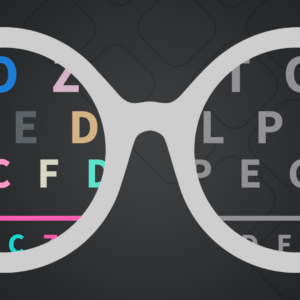
As businesses focus on creating more unique and personalized online experiences, inclusivity cannot be overlooked. In fact, website accessibility is no longer optional — it’s a legal and ethical necessity. With approximately 1 in 4 Americans living with a disability, the question, “What is website ADA compliance?” has never been more relevant.
Ensuring that your site meets ADA or 508 compliance standards not only helps you avoid potential legal risks but opens your digital doors to millions of users with disabilities. So, what exactly does ADA compliance entail, and how can your business keep up with evolving standards? Let’s break it down with the what, why, and how (10-step checklist included).
 ADA website compliance standards ensure that your website is accessible to people with disabilities, aligning with the Americans with Disabilities Act (ADA). While the ADA itself doesn’t explicitly address websites, courts have increasingly interpreted it to include online accessibility, making adherence crucial for avoiding lawsuits and enhancing user experience.
ADA compliance is closely associated with the Web Content Accessibility Guidelines (WCAG), which outlines best practices for inclusive web design. The guidelines cover a broad spectrum of disabilities, ensuring accessibility for users with:
The Web Content Accessibility Guidelines (WCAG) 2.2 are organized into three levels of compliance: A, AA, and AAA, each representing a different degree of accessibility. These levels help organizations prioritize and implement accessibility features on their websites.
Considered a starting point, Level A includes must-have requirements to prevent barriers that would make a site completely unusable for people with disabilities.
Level AA is the standard required by the ADA for most organizations, balancing accessibility and design flexibility. It addresses the most common barriers for users with disabilities.
Level AAA is the highest and most comprehensive level of accessibility, but is not legally required for most organizations due to its complexity and implementation challenges.
It’s easy to confuse ADA compliance standards with 508 compliance, but while both focus on accessibility, their scope differs:
A federal requirement based on Section 508 of the Rehabilitation Act of 1973, which mandates that all federal agencies and their contractors ensure their electronic and information technology is accessible to people with disabilities. This applies specifically to government websites and organizations receiving federal funding.
Broader in scope, ADA compliance is based on the Americans with Disabilities Act (ADA) and enforced through civil rights law. It requires all public-facing websites — including private businesses, non-profits, and state and local government sites — to be accessible to people with disabilities.
Understanding these distinctions is crucial for effectively achieving website compliance.
Achieving website ADA/WCAG compliance involves addressing key aspects of your website’s design and functionality.
Here is a general checklist to guide you:
Ensure that users can navigate your site using just a keyboard (no mouse). This is vital for users with physical disabilities who rely on keyboard navigation or assistive devices like sip-and-puff systems.
Add alt text to all functional images so screen readers can convey information effectively. This includes descriptive text for infographics, icons, and functional images like graphs, charts, and product photos.
For example, imagine you’re a foundation with community partners, and you share their logos on your About page. The alt text of each logo should contain the name of the partner.
Or, imagine you’re a technology firm with numbers to prove your experience (customers served, years in business, projects completed). Each infographic’s alt text should include the copy displayed on it.
👉For complex visuals like graphs or infographics, consider linking to accessible HTML versions.
Maintain high contrast between text and background to accommodate users with visual impairments. Balance brand colors with accessibility requirements to ensure all users can engage with your content.
Colorblind Web Page Filter is one tool you can use to test your site’s accessibility. Another great tool is WebAIM Contrast Checker. This helps test color contrast before you actually build out your webpage, so you avoid using a color scheme that ends up non-compliant.
Maintain consistent and predictable navigation across all your website’s pages.
Headings are more than a stylistic choice. They’re used to create a logical flow to website content. Content should be organized with a logical heading hierarchy (H1, H2, H3) without skipping levels to ensure smooth navigation for screen reader users.
Skipping headings would be like reading a book that, once in a while, skips the chapter title. You think you’re in the same chapter, but the story has shifted entirely to a different part of the story without warning.
Best practice then means starting your page with consecutive headings like H1, H2, H3, H4 – never H2, H1, H4, H3. Then, you can jump back to H2 and so on with no issues.
*Note: There should be only one H1 header on a web page.
Provide transcripts and captions for all multimedia content to support users with hearing impairments.
Your site visitors should also be able to stop any video or audio, especially video or audio that automatically runs on a page.
Code your website to seamlessly work with assistive technologies like screen readers, braille displays, and voice recognition software.
Include an accessibility statement that explains your site’s commitment to accessibility and outlines any known limitations. It should be easy to find and written in plain language. Be sure to provide contact information so users can report issues or request accommodations.
Visit https://www.w3.org/WAI/planning/statements/ for full advisement and examples.
Alert users when a link leads to an external, third-party website or opens in a new tab to maintain orientation, especially for those relying on screen readers.
Speaking of third-party, ensure that third-party plugins, PDFs, and all other external resources comply with ADA website compliance standard, too. Everything hosted on your site should adhere to accessibility guidelines.
Also, ensure that your website’s Accessibility Statement notes if links to external sites have not been evaluated for accessibility.
👉Note: This checklist is not exhaustive. For full accessibility compliance, you’ll want to review the latest WCAG guidelines and/or partner with an agency experienced in website accessibility compliance (Hello, Ironistic!) 👋
Navigating ADA website accessibility standards may sound complex, but it doesn’t have to be. That’s where our partner, accessiBe, comes in. Their AI-powered solutions, including overlays and remediation tools, help businesses ensure compliance quickly and efficiently — no extensive coding required.
accessiBe’s recent recognition in G2’s 2025 Best Software Awards highlights its success in making web accessibility both achievable and effective. With seamless integrations for major platforms like Shopify, WordPress, and BigCommerce, accessiBe enables businesses to effortlessly comply with ADA standards.
💡One especially helpful tool is accessiBe’s page scanner, which lets you quickly scan a web page for accessibility compliance.
Not sure if your website meets WCAG/ADA compliance standards? You can get started by running an evaluation with tools like the WAVE Accessibility Evaluation Tool. This browser extension can quickly identify accessibility issues, giving you a snapshot of what needs fixing.
Partnering with a website compliance expert like Ironistic can also simplify the process. We offer tailored solutions to help you navigate ADA compliance requirements, enhance accessibility, and reduce legal risks.
Ironstic’s ongoing maintenance services mean proactively staying on top of any changes to ADA standards, ensuring your site is always in the clear, while enhancing your brand’s reputation, promoting inclusivity, and elevating the user experience.
🌟BonusOur website maintenance services offer a host of other benefits like security updates, usability and performance audits, and content/SEO audits too.
Want to ensure your site is ADA-compliant? Reach out to our team below to discover more about our comprehensive website accessibility solutions, including our partner accessiBe’s powerful tools. 👇