
What Are the Best PPC Channels?
What to Know Before Running Paid Ads
Not every paid ad channel works the same for everyone. Get expert insight into PPC channels like Google, Meta, LinkedIn,…
Read More

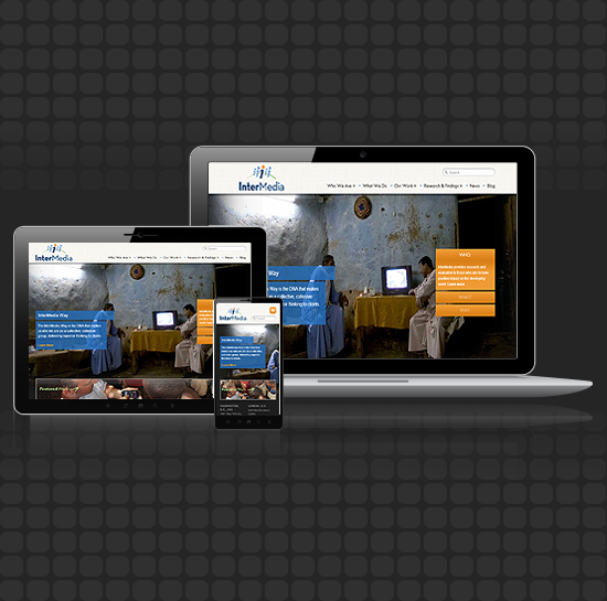 A few short years ago, I remember having several clients ask for two versions of their site, a desktop version in addition to a mobile website. When a user first visited the client’s site, the site would detect what kind of browser was accessing the site and display the correct version. It was an adequate, but not elegant solution for the time. Mobile websites are simplified versions of desktop websites. They display far less content overall and only sometimes were able to capture the look and feel of the desktop version. With the proliferation of smartphones and tablets, something needed to change. Gone are the days of designing just for desktop or just for mobile. Today, there is no standard in devices. New smartphones and tablets are released on an almost weekly basis with different screen sizes, resolutions, and capabilities. In fact, in the U.S. alone, there were more than 400 smartphone devices on the market at the end of 2011 (via ComScore).
To put it simply, a responsive website adapts to the environment it’s loaded in. Responsive design is a term that’s only been around since 2010 but is quickly becoming industry standard. It was first coined by Ethan Marcotte in an article he wrote for A List Apart. He suggested that rather than designing for one width, designing pages that are composed of elements that are placed on the page based on the browser width. Without getting too technical, a media query from a device is sent to the site that focuses on browser width and returns CSS rules that are optimized for that width. One could access a site from their smartphone, their tablet, or their desktop and get very similar user experiences, optimized for their device. In a responsive design, devices do not get redirected to a different URL, and users aren’t seeing stripped-down content. Even Google recommends the use of responsive designs!
Check out Co-Owner, Jared Elliott’s, post on why responsible developers always include responsive design.
In order to connect with your audience, you need to understand how your audience connects with you. In 2011, there were 835 million smartphone users, and 5.1 billion feature-rich phone users (via Business Insider). With technology changing at breakneck speeds, the best way to stay ahead of your competitors is to plan ahead. By designing a responsive website, smartphone manufacturers could create a device the size of a watch, and your website would still function, and be user-friendly. There also isn’t a need for further app development making your web strategy ultimately more cost-effective, not to mention this approach saves a lot of time. Also, Google reports ranking responsive sites higher in their mobile search results, therefore it will be good for your site’s SEO.