
What Are the Best PPC Channels?
What to Know Before Running Paid Ads
Not every paid ad channel works the same for everyone. Get expert insight into PPC channels like Google, Meta, LinkedIn,…
Read More

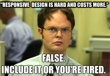 Do not pay extra for responsive (responsible) web design, period.
But I would like you to read on to hear my thoughts. So please do so!
When you start on a new web project, you expect to get the best new features available, right? Well, I do. That is why we never charge extra for a responsive project.
First, what is responsive web design? According to Wikipedia, it is “a web design approach aimed at crafting sites to provide an optimal viewing experience – easy reading and navigation with a minimum of resizing, panning, and scrolling – across a wide range of devices (from mobile phones to desktop computer monitors).” In other words, it allows your website to automatically adjust based on the device that is accessing the site.
For a good example of a website designed responsively (and responsibly), check out a recent site that we built – Members 1st of NJ Federal Credit Union.
Responsive web design really only requires a little more CSS, and not much if you do it right! If you plan the project correctly and if you have a flexible development structure, the responsive design layouts basically build themselves.
I was at a web developer conference in Columbia, South Carolina, and companies were charging, 20-50% extra for responsive design. That is simply irresponsible and ass-backwards. Why are they charging extra? Simple, it is the “used car salesman approach.” Which is: Prey on the people who don’t know any better, and squeeze them for all you can. There is no other good reason to charge for the backbone of all “responsible” web projects. Don’t eliminate or ignore such a large and growing audience for your business. If you think that mobile technology and tablets are going away anytime soon, I have a bridge in NYC I am willing to sell you!
Responsive design is easy and extremely important to optimize your site’s layout based on the screen size of your user. It does not require that much extra code, and it makes a huge difference in the way consumers view your company. Old mobile sites, that were built way back in the EARLY 2000s used to sniff for the user’s device. Responsive design focuses on the breakpoints of the screen sizes for mobile phones, tablets, and computers. This allows for a centralized code base to control all of your “views.” That equals a significant amount of time and money that customers save in building and managing content on the site.
Now don’t get me wrong, situations exist where separate mobile sites are required, and for those sites, a separate build project is essential and should be priced separately. For the vast majority of websites on the Internet, however, a responsive design approach is perfect.
Bottom line: if you are building a new website, make sure that your developer is including a responsive design approach!